
"Studio concept work exploring
illustration forward brand identity"
illustration forward brand identity"
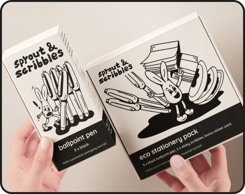
• Earthy muted colors with textured surfaces bring a tactile organic feel
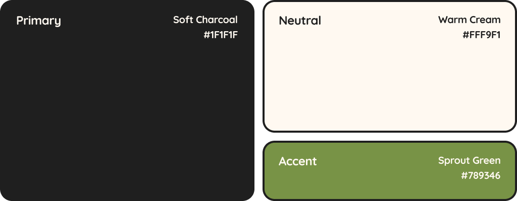
• Charcoal black with a warm cream background creates a strong visual foundation, with green used sparingly as an accent to emphasize eco consciousness
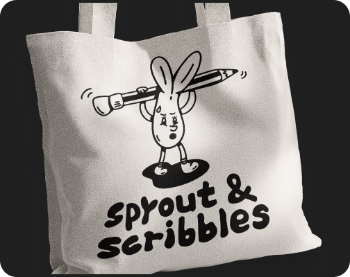
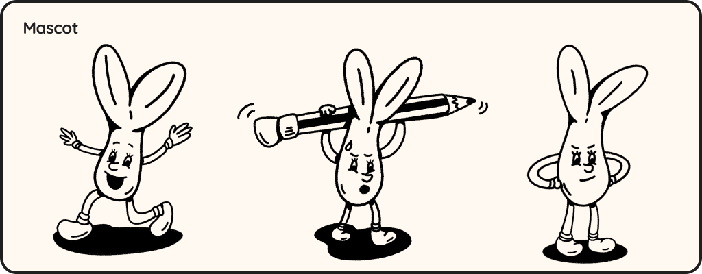
• A playful sprout mascot adds personality and humor, making the brand approachable and memorable
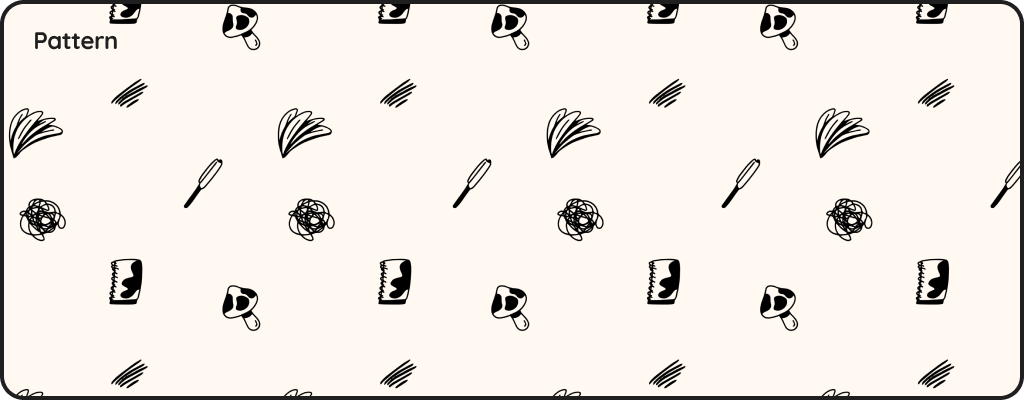
• Retains organic jitter and rough textures, reinforcing the handcrafted aesthetic
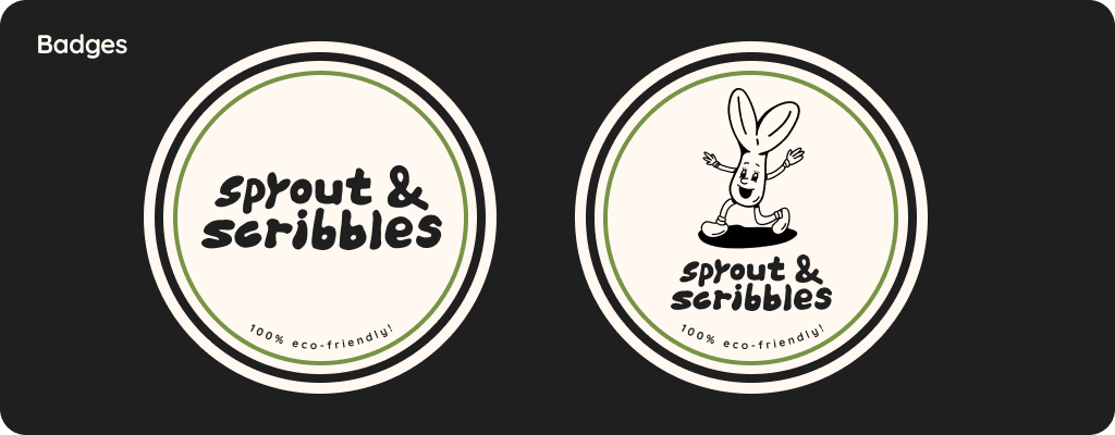
• Badges are versatile assets designed to work across stickers, social media, and packagings
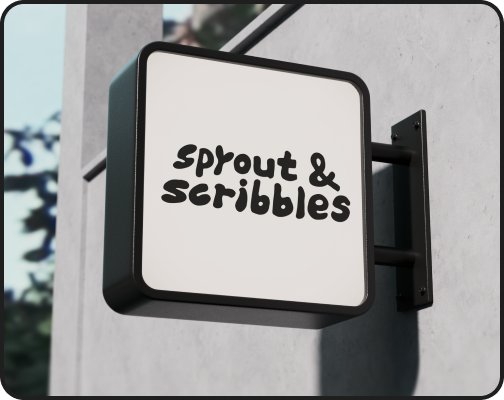
• Quicksand as the primary typeface that balances legibility with a soft organic tone to complement the illustrated elements
