
"Striking a balance between trust and play"
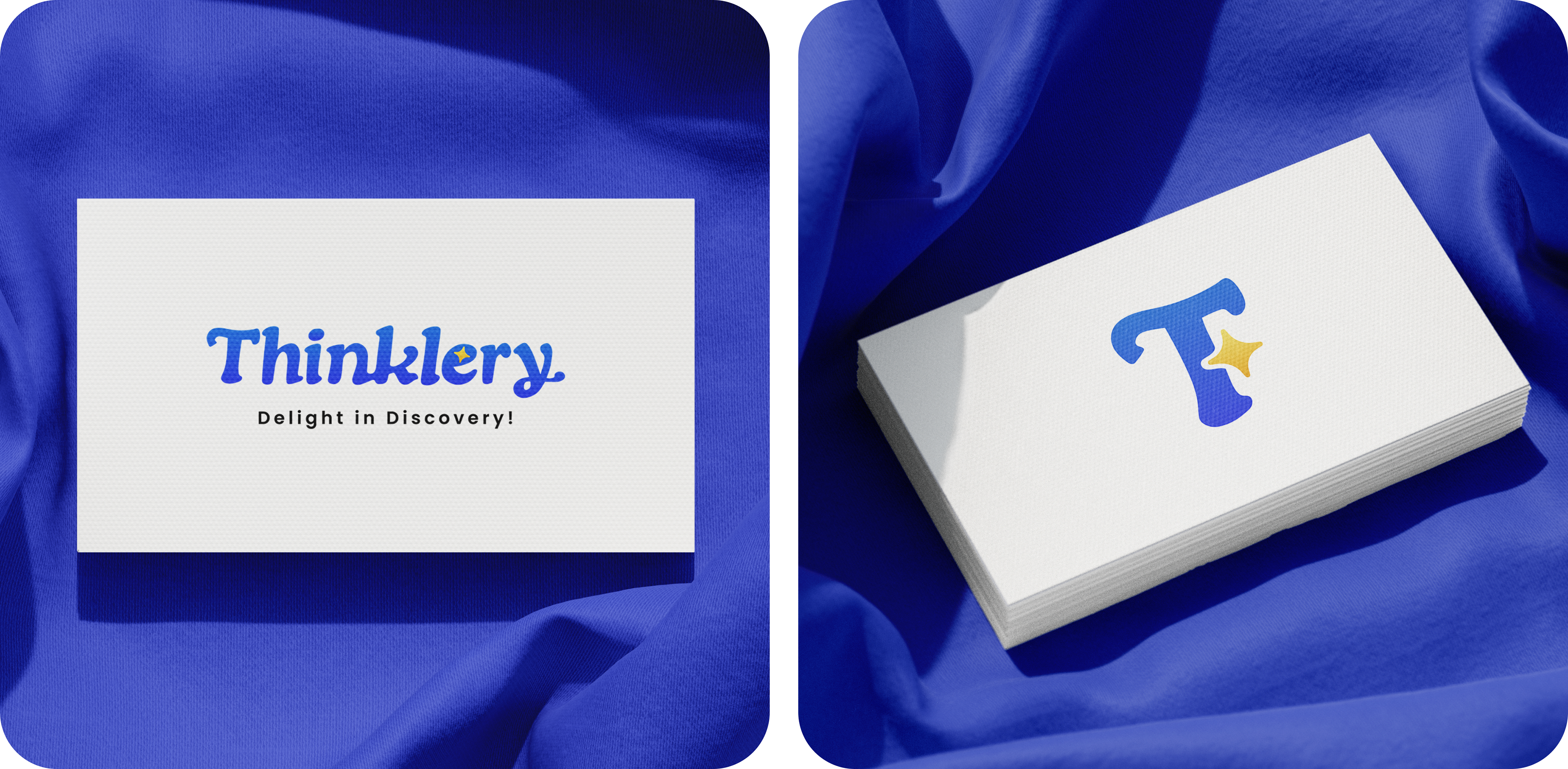
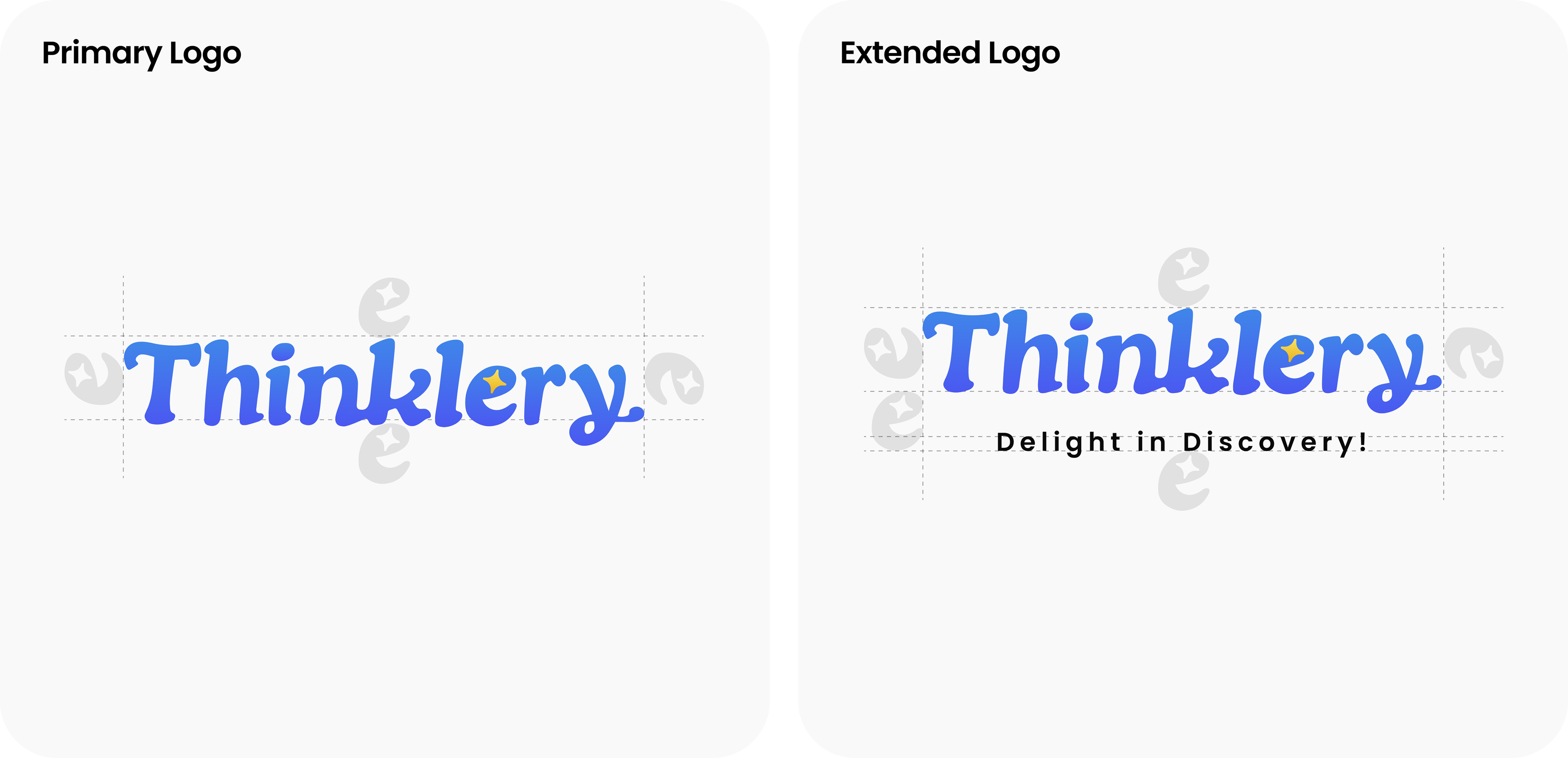
We crafted a custom retro-inspired wordmark with playful ligatures and character loops, paired with a Y2K-styled spark that symbolizes creativity and discovery. The design balances prestige and reliability for parents and investors with fun, nostalgic energy that resonates with younger audiences.
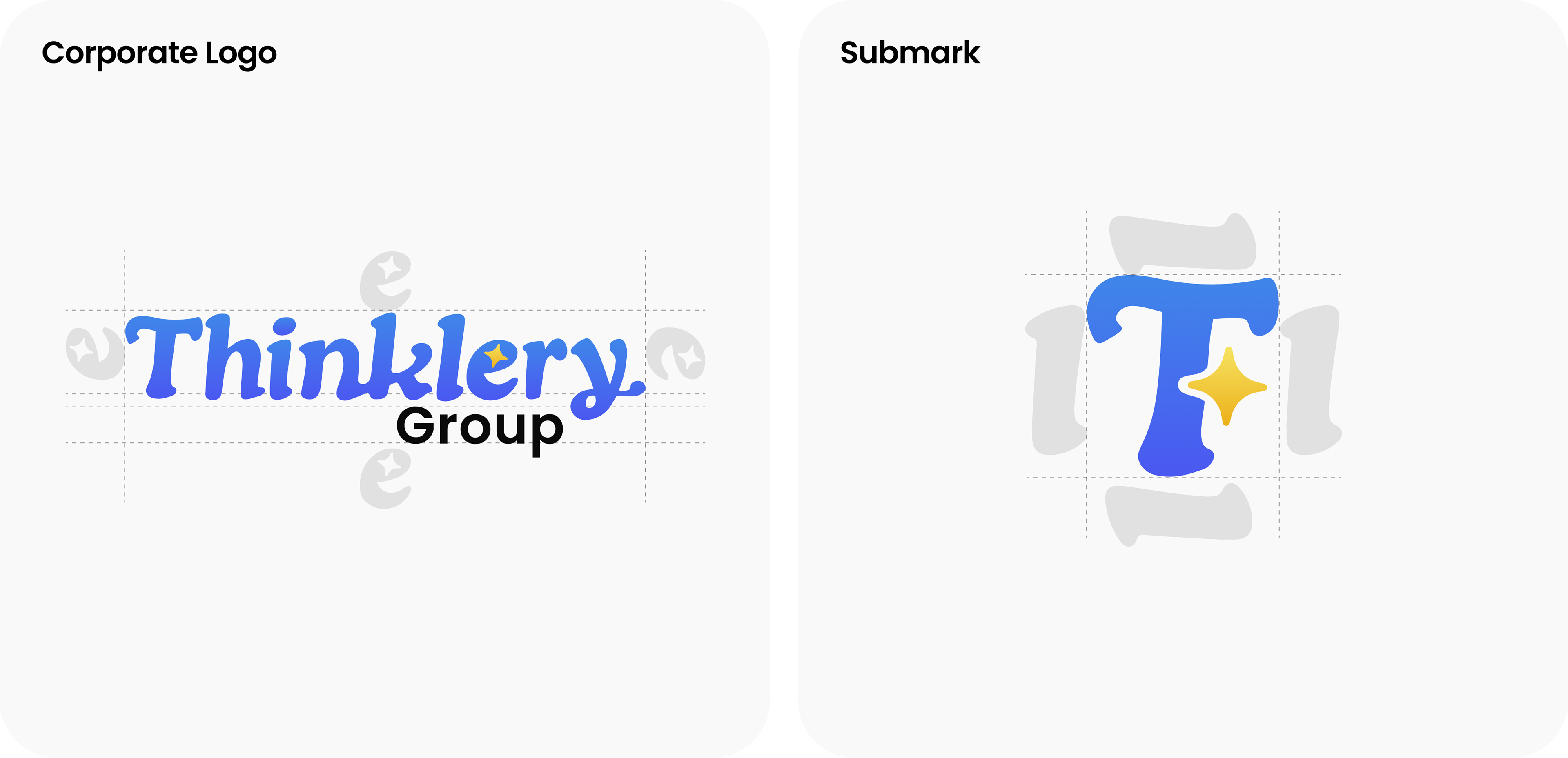
To complement the wordmark, we developed a minimal submark, a simple “T” and spark combination that works seamlessly in smaller sizes and digital applications.
The logo system comes in three variations: vibrant gradients for digital displays, flat colours for print and limited palettes, and a monochrome version for maximum versatility, ensuring consistency and flexibility across every touchpoint.
Even as a logo-only project, the result gives Thinklery a strong, versatile brand system that can evolve into a full identity as the company grows.