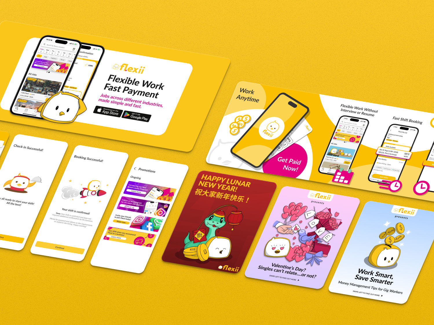

Design Direction
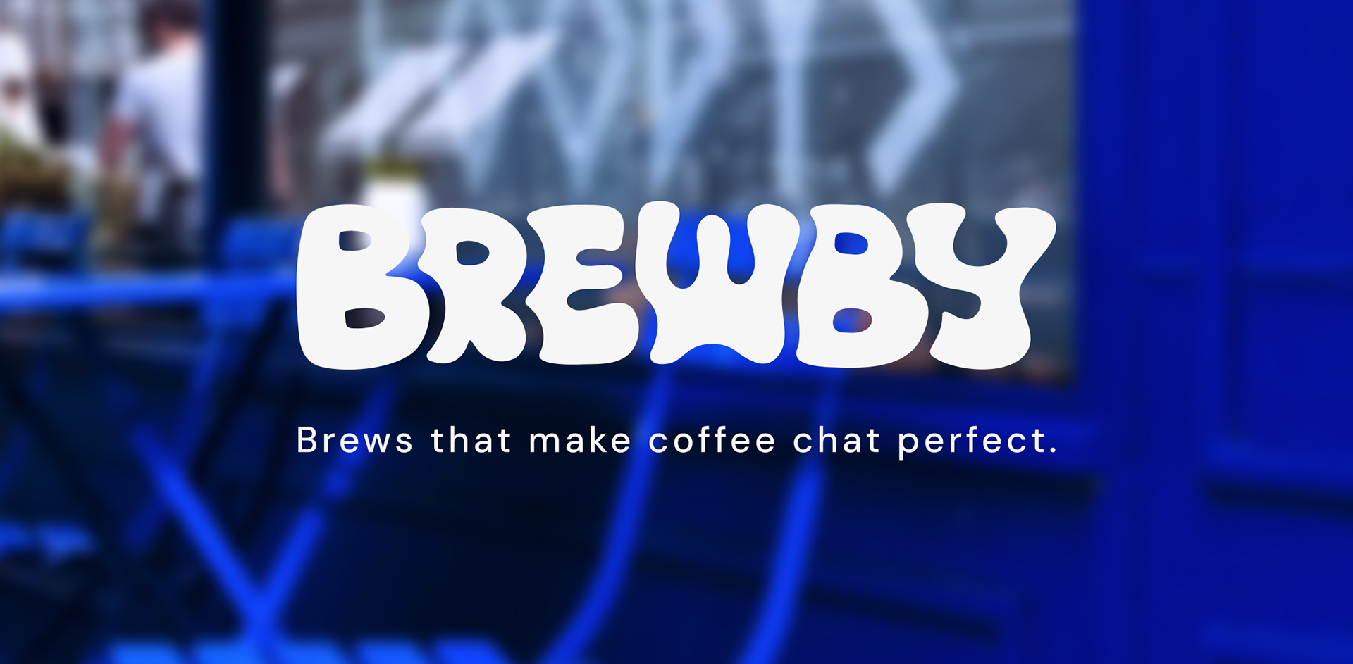
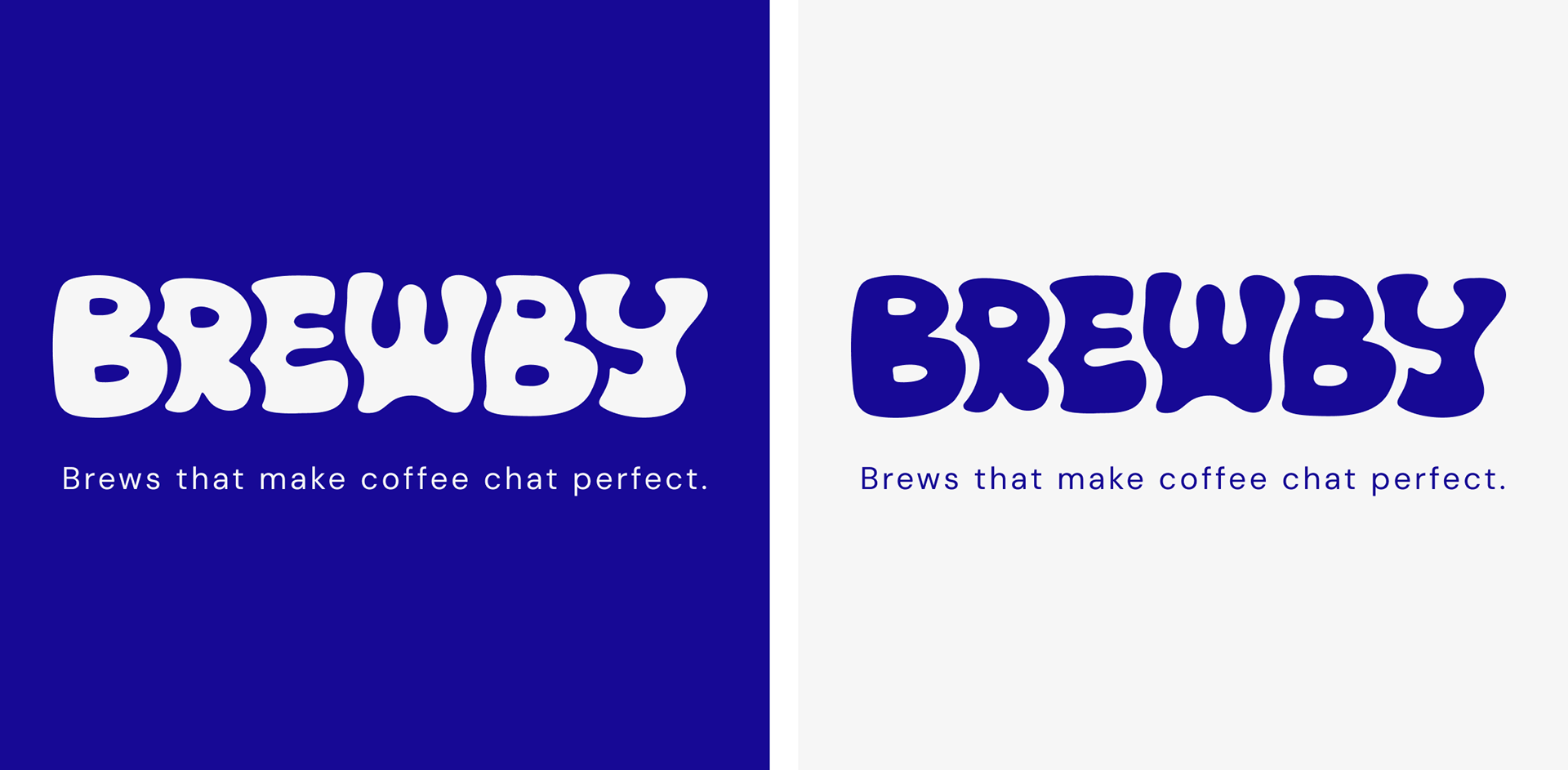
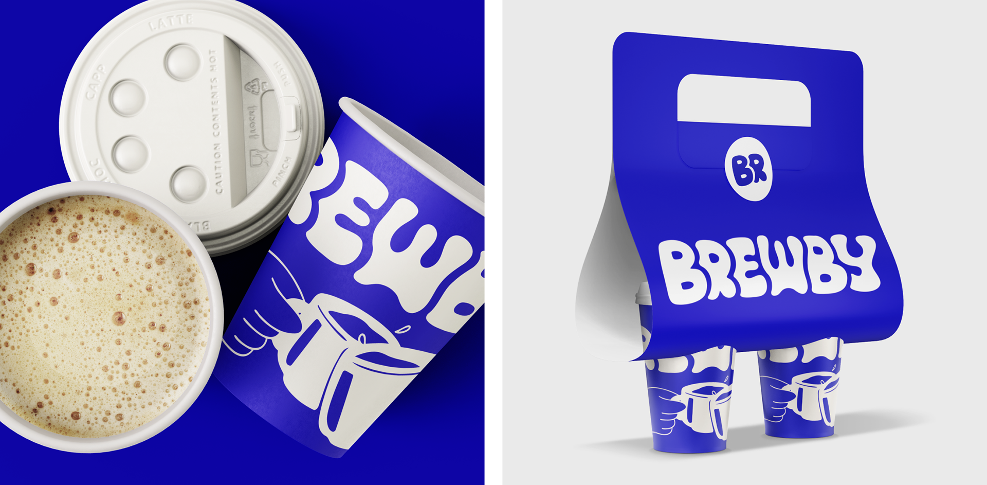
The visual identity combines the vibrant Brewby Blue with hand-drawn illustrations to balance energy and comfort. The bold blue introduces liveliness, while the off-white base and rounded typography evoke warmth and approachability. Together, they revive the spirit of old-school neighbourhood cafés, reimagined with contemporary polish.
Playfulness is at the heart of Brewby’s expression, from the chunky logotype to the playful illustrations. Every element feels spontaneous yet intentional, capturing the authenticity of community spaces where conversations flow naturally.
Playfulness is at the heart of Brewby’s expression, from the chunky logotype to the playful illustrations. Every element feels spontaneous yet intentional, capturing the authenticity of community spaces where conversations flow naturally.
Brand Experience
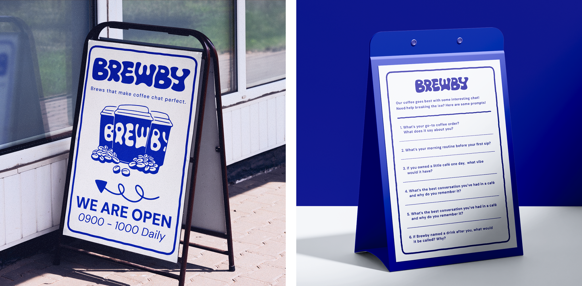
Beyond visuals, Brewby extends its concept into tangible interactions. Each café table features an “Icebreaker Menu” — a set of conversational prompts designed to help guests start a chat or share a laugh over coffee. This transforms the café visit into a shared experience, reinforcing Brewby’s belief that coffee is best enjoyed in good company.
Drawing inspiration from social bars and neighbourhood hangouts, Brewby turns a simple coffee stop into a small ritual of connection, which is an experience in itself.
Drawing inspiration from social bars and neighbourhood hangouts, Brewby turns a simple coffee stop into a small ritual of connection, which is an experience in itself.