Google MyMaps Design Challenge
This UX audit and redesign focuses on Google’s outdated MyMaps, a low-engagement tool with untapped potential within the Google Maps ecosystem.
My Maps Designed by Vicent Koh
The challenge
Google MyMaps allows users to make maps with customised markers and routes. They can add descriptions and pictures to describe a specific markers, and draw perimeters, define a specific routes to follow from marker to marker via a drawn route. There are also advanced function that allows uploading of a spreadsheet formatted file to visualise markers on the map.
From my research, some of the users that finds the concept of the app useful to them includes:
- Travellers who need to plan their trip and places to visit
- Biking enthusiast who explore forest trails and require custom maps for waypoints not covered traditionally by Google Maps.
However, Google MyMaps faces many UX issues that limits its competitiveness in the market, especially with competitors offering better platform compatibility and features.
What users told us
With three days for the challenge, I focused on secondary research to understand how people use MyMaps and where they get stuck.
When performing the research, here are the following constraints I encountered:
- There is a lack of official platforms for review. Unlike native iOS or Android apps where there is a review section to gather feedbacks, this app exist purely on web only.
However, I managed to find discussion about MyMaps through forums such as Reddit and a biking community discussion forum, and there are multiple users sharing what they like and dislike about the app.
I gathered about 7–9 useful comments across the discussions.
What worked
- Customisable, maps with personalised content, good for planning trips with routes.
- Uploading of KML files allow for mapping of routes from other softwares.
Where people struggled
- Outdated and different from the Google ecosystem UX and Visual Design.
- Limited to only 10 layers per map, adds up fast when adding multiple routes.
- No link between google maps and my maps, and not having the advantage Google Maps have to offer (route suggestions, public transport and timings)
- Not having navigation guidance for custom roads plotted in MyMap.
Extra Note: Google maps allow similar function in terms of plotting location (point equivalent in mymaps), but routes are predetermined.
What the audit found
| Area | What I found | Design implication |
|---|---|---|
| Adding and managing locations |
| Keep custom colors and icons. Make Add location visible and give deletion its own clearly labelled control. |
| Editing routes |
| Keep layers for alternate itineraries. Bring route creation into one Routes panel, replace “Draw a Line” with a clearer label, and make route deletion easy to find. |
| Sharing places |
| Explore a way to share individual points of interest. |
| Using the map on mobile |
| Move frequently used tools into a bottom sheet to keep the map visible. Explore navigation guidance and GPS-based editing in a future iteration. |
| Planning travel |
| Explore Google Maps integration for route suggestions, including public transport. |
Choosing what to redesign
I ranked improvements by user impact and implementation complexity. Issues that appeared in both the research and the audit, or blocked a core task, received higher priority.
| Importance | Low complexity | High complexity |
|---|---|---|
| High importance |
|
|
| Low importance |
|
|
For the redesign, I focused on these changes:
- Improve UI Discoverability
- UI Refresh (Based off latest Google UI and Material 3 UI Library)
- Mobile Friendly Design
- UX Writing Improvement
- Clearer way to delete routes
- Redesign of Route Adding mechanics
A clearer way to make a map
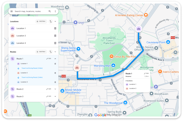
The redesign uses Material 3 to bring the interface closer to the rest of Google’s products. It separates locations from routes and makes the next action easier to find.
Keep locations and routes separate
The search bar keeps map-wide controls within reach. Separate Locations and Routes panels make add and sort easier to find, while a bin icon distinguishes delete from rename. Selecting a route shows the path, travel mode, and distance between stops.
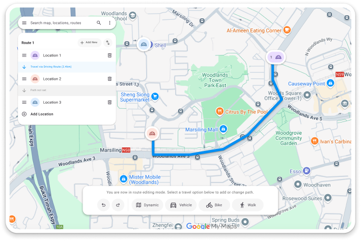
Make editing a distinct mode
Adding or editing a route opens a toolbar with travel options and undo and redo. Guidance on the map explains which action to take next.
Make the path easier to trace
The map dims while you draw so the route and cursor stand out. Tracing completes when the cursor reaches the final marker, so you can start the next segment from that point.
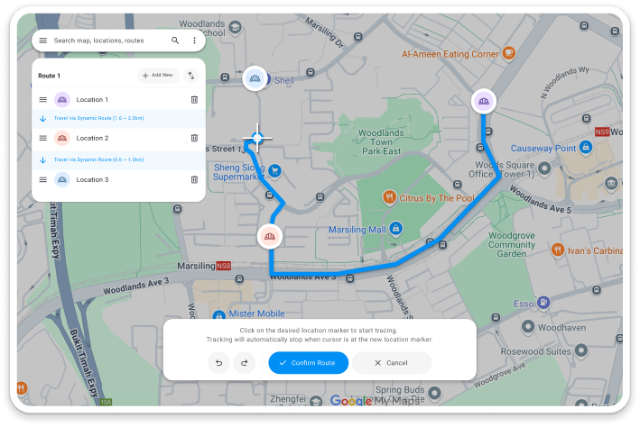
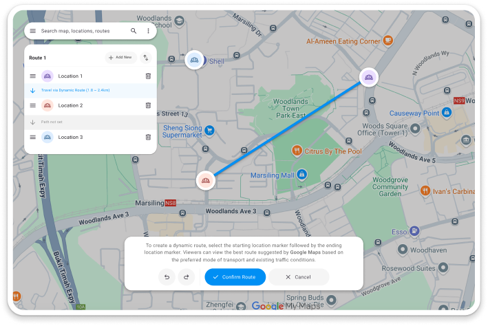
Offer a dynamic route
Choose endpoints and a preferred mode of travel. The proposed Google Maps integration could use live traffic and public transport availability to suggest a route.
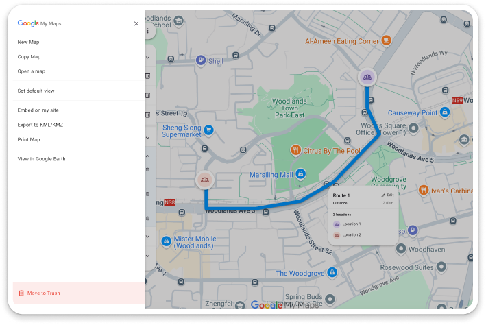
Separate map settings from everyday tools
The search bar opens a dedicated menu for actions such as opening, copying, and exporting a map. Move to Trash sits apart from the other actions.
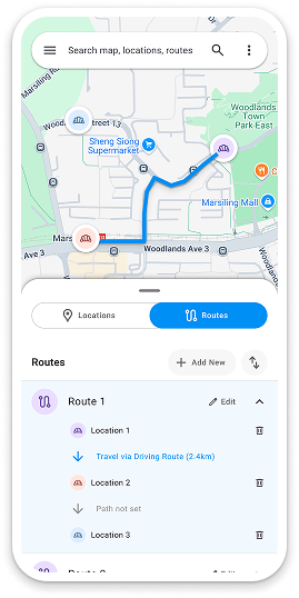
Planning on the go
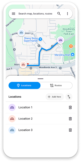
On mobile, locations and routes move into a bottom sheet so the map stays in view.
Keep the map visible
A bottom sheet keeps locations within reach while leaving roughly half the screen available for panning and navigating.
Switch between locations and routes
The toggle gives each task its own view. Switch to Routes to manage travel between stops, or return to Locations to manage markers.
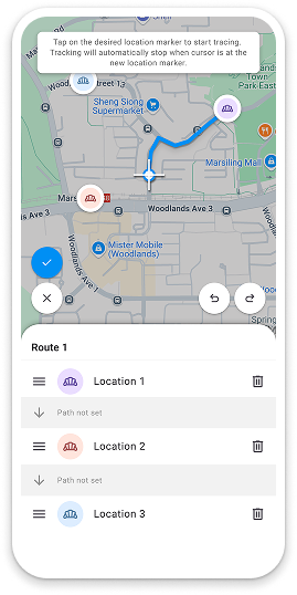
Move the map under a fixed cursor
While tracing, the cursor stays centered as the map moves beneath it. Tools stay around the map so there is room to see the surrounding area.
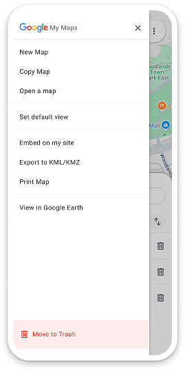
Keep occasional actions in the side menu
With locations and routes in the bottom sheet, the side menu is available for less frequent tasks such as printing, exporting, and managing maps.
What I’d refine next
This design challenge really reflects a realistic scenario of working in a product team, where sometimes there is need to push a new feature or design quickly.
While I have many ideas, I soon realise I may not have that much time to complete the designs, especially since mobile responsiveness is a big part of the redesign in my opinion. Hence, I chose to focus on what I evaluated as the most important.
As a result, the solution and mockups targets a limited scope of pages, primarily those involve in the main user flow, along with a visual concept for the UI.
Personally, I felt that some areas of the user flow could be further refined, and my next stages of progress with more time would be designing the dialogs for adding new locations and the incorporation of live navigation features.